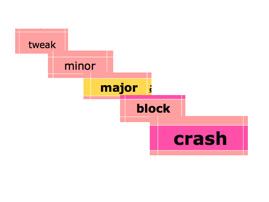
Debugging life : update on an open source readymade
There is not that much of life debuggers yet, just over fifty, but a couple of people already told me that the interface is oppressive, confusing. And that I don’t give enough information on the home page for people to understand the project, before they sign-in. It’s true, and I don’t want to avoid that!
Bad marketing
Debugging life is really an open source readymade : I used a professional code, and put it to use in the way that seemed… an evidence. Struggling with the tool is part of the process, and simplifying the interface too much would change the byproducts generated.
Moreover, debugging life is mainly a text based project. Files and pictures can and have been upoladed, but narrativity is the central focus. I hope in time it will slowly evolve in a maze of connected texts, and the complex interface will be fully part of that maze.
I have slighty devoided of that line, thought. I have made a few changes to guide the newcomers when they’ll add their first bug: an emphasis on a link, a more logical redirection after the password choice, and that’s about all. I plan to ease just a little bit more the barrier to entry, too. As stated, the home page is clearly light, and adding just a few teasers won’t alter the project too much.
Good marketing
Since I gave it a new start, debugging life has been featured at Dorkbot Paris #2. I used the opportunity to play with a business like presentation, not a lot more than 10 slides, 20 minutes precisely, and a very, very big font. It was nice to be linked from here and there (Écrans, Bioject…)
And Juuso, from GameProducer.net, was kind enough to mention debugging life to his readers - mainly game creators that could probably understand the idea of toying with a debugger just for fun…
